Wednesday, December 5, 2012

Getting Along- An Innovative Business Model.


I am a consumer of information and technology. I frequent twitter. The first and last thing I touch every day is my ipad. I carry my iPhone around like a detached limb. I admit this sick obsession with technology because I know I am not the only one. But I’ve noticed something different about my devices.

I had a lot of falling outs with friends in high school. Someone got a boyfriend or became popular. While those falling outs sucked, I got over it. Recently I’ve noticed a lot of falling outs that are seriously affecting the way I run my everyday life. Google maps are no longer available on the iPhone, YouTube is no longer preinstalled, and news broke recently that twitter and Instagram will no longer support each other, making your Instagram pics harder to share on the tweets. While I know these are trivial, I just have one question to ask all these companies. When do you think your feuds are going to start affecting your consumers?

The SECOND I didn’t have Google maps on my phone I noticed. Transit directions are non-existent on the apple app. I still rely on Google maps which I have to access through a browser. So what’s the point of having a smart phone if the apps I use most aren’t even available on my device anymore? I like my apple products. I think the design, interface, and quality are perfect. I do not want to get a different device because Google decided to join the tablet race.

Design and innovation are powerful things. They make the world a better place. But if companies start putting restrictions on the type of devices able to access applications then how are we expected to move forward into a world where innovation is accessible to everyone. I understand that there are politics and feuds but this is the world of business. Come to a compromise! Although these technologies are innovative in and of themselves, maybe the better innovation would be to find a way to work together. Humans are very strange. We have egos and pride and let our differences get in the way sometimes. If you’re company is trying to make the world a better place with its product maybe you should try to make the world a better place by having strong relationships with your business partners.

Instead of keeping their own agendas in mind, companies should collaborate together and keep their customers in mind. One day I had a phone that was functioning in all the ways I needed it to. The next, my beloved apps were gone. It’s unprofessional. Pull yourselves together and come to an agreement. Think of making consumers more efficient. It only makes sense that innovative companies should do business in innovative ways.

Wednesday, November 21, 2012

Ad of The Week: FAB

 
This week's ad comes from fab.com. If you're not familiar, get familiar. Use this link to sign up for access to this AWESOME store! http://fab.com/snxyfs


Fab takes products from existing stores and promotes them on their website by selling these products at a reduced price. All the products they sell are heavily designed with design in mind. This makes the products unique and more functional. The reason this ad is so good is because it's showing off a variety of the products they sell and showing you how you can change your lifestyle by using this site.
 
There are quite a few benefits that this wonderful ad sell:
 
1- Diversity: There are so many products on this site that don't neccesarily go together or even come from the same line or designer. But some how most of the products work well together to create creative, well designed spaces. A lot of the products fit within the relm of hipster, techy, indy... so the majority of the prodcuts compliment each other aesthetically.
 
2- Accesibiliy: Fab is an online store so you shop at home. This guy didn't even have to change his pants and he redecorated his whole hipster loft. He even got a new wardrobe.
 
3- Speed: Now the speed in which he received his new swag are is a little exaggerated but Fab is trying to have faster delivery and have just announced free shipping for orders over $75.
 
Not only does this ad have a strong concept but it's also entertaining and fun. Kudos Fab.

Wednesday, October 24, 2012

Passport to Paris


My latest artistic fling is probably one of the most fun projects I have worked on. A few months ago I went on a soul searching trip to Europe. I was gone 2 weeks and hung out mostly by myself. I was so inspired by the culture, history, and art that I wanted to create something to commemorate my experience. So when I was trying to find something to create, I thought about doing a series of posters that would highlight the different cities I had seen. But I also wanted to create something I really hadn’t had much experience making. I wanted to make a book, a tour guide book. My loyal travel companions were Rick Steve’s guide to Paris and London and I felt inspired to make something that a fellow traveler could appreciate. I don’t know if you’ve ever been to the travel section of Barnes and Noble but it’s an overwhelming collection of thick European guide books. I also had only been in each city of an average of 3 days. I wasn’t exactly an expert on these cities. So I took a step back. I wanted to create something that would allow for creativity and let me explore designing a book.


I have to give you a little bit of my personal background for you to fully understand the next decision in the process. I am the oldest of 7 children and have practically raised a few of my siblings. I also spent 5 years of my life teaching swimming lessons to children. I worked as a costumed Princess at children’s birthday parties through college and I currently babysit on the weekends for some extra play money. Oh, and there was that brief stint at BabyGap. So naturally my next choice would be to create a tour guide for children. I looked online, bookstores, and on the bookshelves of the kids I babysit. There aren’t a lot of tour guide books for kids. So I decided to make a book that would allow for some education and fun. It would have to be for kids ages 6-12. 6 year olds know how to read and would be interested in having their own book. Anything over 12 is hopping into teenage territory and having teenage siblings I know that they might find a book like this juvenile and just another lame thing that have to participate in while on family vacation.

Fun Facts notes

Instead of lumping all the cities I traveled to (Dublin, Berlin, Paris, Madrid, and London) into one book, I choose to start with one city. As a starting point, I asked the kids I babysit which city would most interest them. Paris. It is the most mentioned city. I think most American kids have an understanding of what Paris is. So I started there.
I wanted to create a book that kids would take with them on their trip. I wanted it to be an entertainment piece while kids were waiting in line, sitting on a train, or walking through a boring museum. I wanted to take the historical things that I found fascinating and explain to children why they are so cool. I decide to do this through a check off system. I wanted to create challenges for kids that they could do at each site. In the book it would give a challenge and hopefully it could be educational. For example, at Notre Dame, one of the challenges is to find and stand on the bronze circle near the front of the cathedral labeled “Point Zero.”The challenge then explains that this is the place in which all distances are measured in France. It’s literally the center of France. While my audience is children, I assumed that my audience would also have an engaging adult figure. The book is meant to spark the interest and curiosity of the child and then the parent would supply more information through their own personal knowledge, adult targeted guide book, or landmark pamphlets and plaques.
Saturday brainstorming session
I also created the book to be more like a passport. Complete with French flag stickers, each time the child goes to a new destination outlined in the book, they would be able to mark the page with a sticker. This develops another level of challenge and the whole vacation becomes a game. I think American kids today are extremely competitive and have a sense of fulfillment and pride when they accomplish something. This game will make each museum or landmark another necessary piece to the puzzle they are trying to solve.


Creating a cross wrod is harder than you think
Speaking of puzzles…I’ve also included crosswords, word searches, mad libs, mazes, blank pages for coloring, and lined pages for writing. These activities will provide entertainment while waiting in line for 2 hours to take the elevator to the top of the Eiffel Tower. I talked to a 9 year old who recently toured Paris for 2 weeks. She said there was a lot of waiting. I kept this in mind when I was thinking of content. There are also Paris inspired stickers in the back of the book because, frankly, children just like stickers and they will put them on one of the blank sheets, their clothing, or any dry, flat surface.

Originally, I planned on making this book larger and fuller. I wanted to have it be more like a scrap book where you could keep all your metro tickets, museum passes, landmark brochures, and fun photos but I thought it would be extremely difficult to ask a child to care a huge book around Paris. The smaller 3.5” x 5.5” size is a good pocket size and is more on a kid level. Kids have smaller hands, smaller bags, and smaller pockets. This is book made for them.

I hope to expand the book into a kit, something that could be separated into 3 or 4 parts. The first book would be more education, reading heavy. Maybe something they would read before the trip or while they are traveling to Paris from the U.S. The second book would be the passport that I created. The third part would be the scrapbook. The forth part would be a pouch or bag that would collect the metro tickets, brochures, and museum passes while the kid is traveling. It could also be the passport holder.
I also wanted to start thinking of a way to make it digital. With Apple’s announcement of the ipad mini yesterday, I think kids are going to start having more access to digital books. I would almost expect a family to be traveling with a tablet device now days, especially on an 8 hour plane ride.
This is just the first version of my book and I hope to keep refining it and hopefully find a way to mass produce it. The kids I babysit think it’s maybe the coolest thing ever so I’ll continue to be their Friday night babysitter.

Lastly, I would like to thank all those people who provided feedback and ideas. You’re awesome.
Jason Early, Chris Gerke, Hannah Rebernick, Elain Chernov, Lindsay Lewis, Katherine Theoharpolous, Daniel Cloward, and of course Sarah and Natalie Rovner.

Wednesday, October 10, 2012

Be Spontaneous.

So today is Wednesday. It's been 3 days since I launched my new site and the response has been great! I have received many compliments and 4 different calls/emails for new freelance work. I know this entry is brief but I just wanted to thank everyone for their compliments and let you know that making this small change has effected me dramatically. The thought of changing my site came rather out of the blue and I just spontaneously decided to change it.

If you ever have that urge to create something or change something, do it. I guess that's just how I live my life. Every spontaneous decision I've made, whether risky or safe, has turned out to be wonderful.

For those who know me, I moved to Chicago rather spontaneously. I visited Chicago once, for three days. 6 months later I took 4 suitcases and bought a one way ticket. 5 years later I'm still here and a completely a different, and better, person because of it. I could give many other spontaneous and crazy stories that have made my life better but I will spare you those for a later day.

Keep creating stuff! Good luck, fighters!

Sunday, October 7, 2012

New Website!

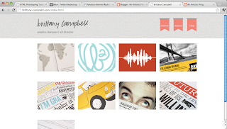
Today's artistic fling is a new website!!! I spent this weekend taking photos, organizing files and playing with bootstrap. I was introduced to bootstrap about 7 months ago. I was working on a website design and the developer suggested using bootstrap to prototype. After lots of tries and reading and rereading the website, I couldn't figure it out.

When I was at Prototype Camp in August I listened to John Haddon from nice ux talk about using bootstrap to prototype. He gave us a short tutorial and also a link to the nice ux website that would help with using bootstrap.

This week I've been thinking about my online presence. I'm so embarrassed to give people my website because it's not well designed, user friendly, or up to date. So this weekend I buckled down and got to work. I started with sketches and came up with a basic wireframe. I started working with bootstrap and seeing what limitations I had.

One of the things I learned at Prototype Camp was "hunkering." Jared Spool, the founder of Interface Engineering, started the day by talking about prototyping. He related web prototyping to other kinds of prototyping. He shared a story about studying the way carpenters work. They would sketch out the idea of a kitchen cabinet. Then they would lay all their materials out on the floor. They'd take a look from a few feet away then come back and arrange the materials. Then they'd start building. After a few minutes of construction they'd take a step back and analyze what they had been working on. Then they'd make adjustments accordingly. This is called hunkering. Every designer has an idea in their mind. They know exactly what it looks like but sometimes that idea isn't possible in the real world. Hunkering is the act of compromising both your ideal solution and reality.

Hunkering. That's what I spent most of the weekend doing. I had to reorganize files, resize photos, and play with code. The website came out a little different that what I ideally wanted but it works good, if not better, than what I had originally wanted.


BEFORE


AFTER


Please check out the site and give me any feedback. I'll be adding more work in the next few weeks because I've been working on some new projects so keep checking back!

brittany-campbell.com

Thanks!

Wednesday, October 3, 2012

"Practice Safe Design. Use a Concept."


I misuse the word consistency about a dozen times a day. Sometimes if I can’t explain my reason for making something look a certain way, I tell my client or fellow production team that I did it for the sake of consistency. How can you argue with consistency? The people I usually deal with don’t argue and I get the go ahead. But isn’t that just lazy? Yes. Yes it is. I’ve been schooled in the thought of always having a reason to back up your choices. It doesn’t sound like rocket science but a lot of the people I went to school with and still interact with today don’t understand the important of creating with a concept.
I guess this method of creating a strategy for every design choice I make was set on by a series of annoying questions. I guess it really wasn’t even a series of questions. It was just one question frequently repeated. “Why?” I was working at a studio where the boss man would just look at what I did and all he would say was “Why?” Really, I’m not kidding or even being slightly exaggerative. I would say “What do you think about this?” He would repeat “Why?” So I would just start explaining everything because I didn’t know what he was questioning. He would give feedback on what I had presented and give me ideas on how to make the strategy work better. That’s the important part. I had to explain what I was trying to accomplish with my design. If the design wasn’t correctly accomplishing the goal, then the boss man would let me know.


The interesting part about this process is that I would see the flaws in my design choices while I was explaining them. It happens to us all the time. In our heads everything makes perfect sense. But when we start to explain it, or even say it out loud, we see the flaws. In hind sight, I know that my boss was trying to get me to understand the actual problem and try to see the actual solution. If you don’t know this already, design is nothing but problem solving. There are multiple ways to solve every problem. It is our jobs as designers to find out what solution is the best option. We aren’t paid to make pretty things sparkle. We’re paid to create and test solutions.

Just yesterday I had a client come back and say they changed their minds on a cover design that we signed off on months ago. The cover didn’t have the “see-say” effect the client wanted. (For this I will direct you to Chip Kidd’s TED talk. That’s all I will say about that.)

The client suggested a different cover idea. We tried this idea when we were developing concepts for the cover. This idea was one of our firsts to be discussed and one of the firsts to be thrown out. It only focused on a small percentage of the content instead of equally representing the content as a whole. We ended up going with a concept that was a little more abstract but was able to communicate many different ideas thorough iconography and semiotics. So even though this concept was strong and had been signed off on months ago, the client still wanted something different. I couldn’t understand why. Everyone on our side knew the symbolism of the colors, photography, and textures. So why didn’t the client? The client internally asked “Why” and wasn’t supplied with an answer.
I’ve learned that you can’t wait for your client to ask you why. You have to tell them why. I will take full responsibility for not explaining to the client why we did what we did. I sent them the file with a “What do you think? Please have updated content ASAP.” That’s not how you write an email, people. Look, I’m becoming an adult. I should have explained to the client why we made the choices we did. I should have explained why each element on the cover was vital. This would have prevented rebuttals and it would have made our design and our opinions more valuable and trusted. To be completely honest, if this wasn’t a client on the other side of the country, we should have just met in person.
I know longer work with the boss man that would annoyingly repeat “why” but he did teach me a good lesson. After a while I didn’t have to have anyone ask me why. I started asking myself. Each time I sketch an idea, mock up a concept on the computer, or select a color scheme, I ask myself why. If I can’t justify a reason, I don’t do it. That just means there’s a better solution out here that is accompanied with a reason.

I am currently working as an in house graphic designer. I work with only one other creative person and a handful of financial minded people. My job consists of making infographics, conference materials, and quarterly publication that comments on the economic climate in the Midwest. Asking myself “why” before I sit in meetings with those who don’t understand design has saved me lots of pain, suffering and time. Each meeting I show my solutions and they throw back their opinions of what should be done. They change the layout and start sketching on their legal pads. Then I stop them and explain that I’ve explored many concepts and explain why what I’ve chosen works.
 I try to use words and perspectives that are important to them. For example, these people think in dollar signs. I explain how two columns will lower our paper content. I bring back up. I show them other designers and organizations that have used similar solutions. My boss (and only other creative in the office) frequently says “Explain it like they were 5th graders.” I have to remember that while I was in art school learning about complimentary colors, these people were in a master’s program learning about interest rates and inflation. They have their specialties and I have mine.

It's important to be able to communication your reasons but developing a reason while you design will not only make your solution stronger and easier to explain but it will help you find the best possible solution.


Sunday, September 9, 2012

The Mormon Ads

The Church of Jesus Christ of Latter Day Saints, aka The Mormon Church, has a lot of publicity as of lately. Mitt Romney, a member of the church, is running for president, there's "I'm a Mormon" ads all over the internet, and of course the Book of Mormon Musical. The musical won 9 Tonys in 2011 and is now touring the country.

The musical was created by Trey Parker, Robert Lopez and Matt Stone. If the names of Parker and Stone sound familiar, you're right. Parker and Stone are the creators of South Park. Remember the Mormon inspired episode of South Park? Yeah. That happened. It was pretty humorous but unless you are familiar with the church I bet you didn't get half of the jokes. Even the few songs from the musical I've listened to are more like inside jokes for members of the church. It's important to note that the musical and the South Park episode are 100% satire and tend to laugh AT the church instead of laugh WITH the church. It might be interesting to know that the creators of South Park are former church members themselves, which might explain the reason why some of the jokes would only be understood by church members. 

The Ad of the Week focuses on the ad the church has placed in response to the musical. The church has purchased ad space in the PlayBill of the Los Angeles production of The Book of Mormon Musical. And it's actually kind of brilliant.


The message of the ad is just "Read the book." I think the copy "The book is always better." Really appeals to the audience. I think that people who are attending Broadway musicals are typically a little more cultured. I think they are the kind of people who see a movie and say "The book was better." I really like that the ad isn't too over bearing and doesn't give the "churchy" vibe. It's plainly stating read the book and see what the Mormons really believe. 

The church came out with a statement when the Musical started they said "The production may attempt to entertain audiences for an evening, but the Book of Mormon as a volume of scripture will change people's lives forever by bringing them closer to Christ."


Church spokesman Michael Purdy discussed the ad placed in the Play Bill saying "Patrons of the musical aren't likely to leave the theater with a better understanding of the Book of Mormon. Our message in the PlayBill invites the audience to seek a more complete perspective on the book, its Christ-centered message and its place in Mormon belief."


The church within the last two years has been steeping up their advertising. Just last year the "I'm a Mormon" ads could be seen on Hulu and Youtube. There's actually a whole youtube channel dedicated to the "I'm a Mormon" campaign. This campaign focused on a certain individual that was a member of the church. The individual would talk about their life, interests, family, ect. Then at the end of the ad they would say "My name is ______. And I'm a Mormon." 


I have compliments and criticisms for this campaign. We will start with the compliments. I think it's nice to give members of the church a chance to talk about themselves and break the stereotypes that outsiders typically have about members. The first time I saw this campaign I remember thinking ok, this has got to be an ad for Walmart or some kind of service that a busy family man can't live without. I was completely shocked when he said "and I'm a Mormon." It totally caught me off guard. This ad was for the church. 

Now to my criticisms. This might be a little hard to explain but I will try my hardest. Being a member of the church, I have been told time and time again by leaders of the church to not refer to ourselves as "Mormons." This term doesn't tell non-member who we are. A lot of people don't actually know that the Mormon religion is a Christian faith. Using the name "Mormon" detracts from that. It makes us sound like we base our religion off Mormon and not Christ. But if non-members knew that the church was actually called "The Church of Jesus Christ of Latter Day Saint" then there would be no doubt in who or what the basis of our religion is. As a designer, I believe the name church members call themselves  is very important. It's a branding issue. 

Of course people outside of the church think members worship Mormon. They are called the Mormons. Christians call themselves Christians because they worship Christ. Mormons are just another denomination of Christianity. Which is why church leaders urge church members to say "I belong to the Church of Jesus Christ of Latter Day Saints." For those of you who aren't members, we even have a song that is taught to young children that has a catchy little tune repeating that phrase. It is followed by the words "I know who I am. I know God's plan. I'll follow him in faith." That's pretty much one of the most Christian things I've ever heard. 

So why do I think the "I'm a Mormon" campaign fails? It's not educating people about what the church and what members believe in. It's telling people that Mormons aren't freaks but it's still calling members Mormons. I understand that non-members are more familiar with the name "Mormon" but I still  think this ad is just trying to improve the reputation of members and not necessarily educating people about the church.


That is why I think the Play Bill ad is so brilliant. It doesn't say anything about Mormons. It just has the book cover and a link where you can request a free copy of the book and hear testimonies from members of the church. The website has a HUGE header that says "Another testament of Jesus Christ." That is what the "I am a Mormon" campaign is missing. It was selling the life style of the church and not necessarily the message of the church. If I had to compare the church to a product I would say that the feature of the church is the lifestyle but the benefit is Christ. The Play Bill ad just asks you to use your faith, a main principle in the religion, and read the book to learn more about Christ and eventually more about the church and its lifestyle.

Now I can't say how many people will actually go to the website or use the QR code (actually I really hate QR codes and I am judging the ad for using them) but I can say that it will get people to actually think about the book as a religious text and maybe one day they will consider picking it up and reading it.

Sunday, August 26, 2012

Precalculus and Prototype Camp

This weekend I was able to attend the first Prototype Camp in Chicago. It was focused around the phase of the design processes known as prototyping, specifically, prototyping for web sites.

Although I would like to do a recap of the conference I won't because I don't think I would be able to do it justice. I do want to talk about one thing that I may be taking out of context.

At the end of the conference there was a panel featuring Shay Howe, Jared Stool and Ryan Singer. Ryan Singer of 37Signals was talking about this idea. Now, he is a developer so he was using this idea to describe something that I wasn't very familiar with. However, I was able to take the basic model of this idea and apply it to graphic design.

He said there is always a goal that we have. We will always be moving towards that goal but we will never reach it. This was hard for me to understand. I think everyone else in the room looked a little confused because he drew a picture on the white board for us. He drew an x and y axis. There was a star at the top of the y axis. He then drew a curved line that approached the star but then ran almost parallel to the y axis once it came close to the star. He explained that while we will always be approaching that goal, it will never happen. Sure, we will come close but it won't happen.

I vaguely remember this idea being taught in my precalculus class. I think these are called asymptotes but I flunked out of precalculus so I can't be sure.  In high school I remember thinking that this was an absolutely stupid concept and that I should get out of this class immediately. How could a line that is approaching a target keep going on for infinity but never actually meet that target? It made no sense. It's actually really bothered me my whole life. Up until yesterday. I was finally able to take this concept and interpret it into a way that I could understand. It's an interpretation that I hope anyone reading this post will understand.

So. As a young designer, not unlike other young designers, I take a lot of inspiration from previous designers. I look at things that have already been done and try to incorporate existing styles into my work. It may not be right, but this is how a lot of young designers learn and eventually create their own style.

So lets take this idea of approaching a target but never reaching it and apply it to emerging designers. Let's say I really look up to Jessica Hische, not unlike a lot of young designers today. Maybe I want to make a brochure in the style of Jess. But my skills are not as good as hers. I am aiming to make something that could be like hers but right now, with my skills, I can't do that. I may be approaching that target but I won't hit it. Not right now anyway.

So  it's a little daunting. I even felt a little incompetent while I was thinking about this. I want to be like somebody but according to this drawing on the board, I never will be like that somebody. But is that a bad thing? I mean if all the designers who want to be like Jessica Hische could actually be like Jessica Hische then this world would just be full of really pretty book covers and not as much design diversity as I think we need.

But while I approach this target, trying to mock Jessica's style, I might encounter another style. Something unique. Something that's my style. That line that was continually approaching the target may take a turn and start it's own unique path.

So at this point, I'm on my way home from the camp sitting on the train. I think I'm pretty clever for making this discovery. I'm thinking up all these ways to present this idea on the blog. Then I realized, this is just design evolution. Just like the evolution of the species, designers have to evolve in order to create diversity. So, in the end, all of the designers out there who look up to veteran designers, we're just a bunch of mutants. To be honst, our design heros are probably just a bunch of mutants themselves. And you know what, it's a wonderful thing.


Saturday, July 28, 2012

Screen Printing

Over the past 4 weeks I've had the opportunity to take a crash course in screen printing through The Chicago Printmaker's Collaborative. This is my first Artistic Fling where I have used a class to learn new tricks. I loved doing this. I was able to meet new people in the design community and network with other types of artists in addition to learning screen printing.

So to give you a good idea of what I did, I'm going to walk you though my process.

1. Design
So I really wish I spent more time making a good design for the class. Class time was used for the actual production of the design. I hadn't really made any design before that I wanted to screen print. Since this would be my first time screen printing, I wanted to make sure that I had a design that would be easy for me to learn on. I decided to base my screen print off a picture that I had taken while in London.


I then took to pen and paper sketching the car because I wanted it to have  an illustrated look. I scanned the paper into the computer and did some touch up work. I made different layers just so I could see what the finish product might actually look like. In screen printing, each color must be printed on a separate layer. I was only working with 2 colors so I only needed 2 layers.


2. Grease it up, baby.
So after I had printed out each layer in black and white, I needed to grease the paper up with some baby oil. In order to burn your design into your screen, the paper must be translucent. The design should be printed on the paper in black in order to block light from getting to the screen. Some screen printing tutorials teach to print on mylar. Greasing up the paper is easier, more cost effective and works just as well.


 3. Go into the scary basement.
Now it's time to head to the dark, scary basement so we can grab that photo emulsion. Using a trough, I put a thin layer of the emulsion on the screen. I let the emulsion dry for about a half hour next to a fan. Then I grabbed my prints and headed to the light box. I placed the prints on the glass in the light box then set my screen flush with the glass, sandwiching the prints between the glass and the screen. A vacuum makes sure the screen is pressed tightly against the glass to insure no unwanted light gets to the screen. About 7 minutes later I have a screen that displays the shapes of my layers.


 4. Please don't eat the Mac and Cheese.
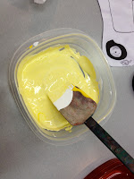
While I was waiting for my screen to dry and expose, I mixed ink. This is probably the hardest part of screen printing. I was trying to make a color similar to the yellow that was in the photograph. It turned out to look like mac and cheese. So I decided to mix up a turquoise color. That was just as hard. So I decided to use both colors and just have ugly colors. Once I printed the colors they dried into wonderful shades. So I guess my color mixing experienced turned out to be better than I thought.


 5. Sectioning off your layers.
While you can print multiple layers on one screen it's important to cover any layers you won't be printing at that time. Ink has a mind of it's own. It's best to be able to control where it can and cannot go.


 6. Getting your hands dirty!
Now's the fun part! Printing. You've got to place the ink at the top of the image and take your squeegee and pull it towards you. Then you keep doing it over and over again on different sheets of paper. It's handmade mass production. The best, and worst, part about screen printing is the margin of error. Sometimes I would have mess ups because either my screen was sticking to the paper or I made general mistakes and had little experience. Either way, each print turns out a little differently. Each piece has it's own unique character.


7. Lining up those layers.
Now that I have the first layer done it's time to move to the next one. I section off the next layer and go through the printing process again. This step requires attention to detail. You have to make sure that each layer lines up with the previous layer. I did this by printing the new layer on a sheet of mylar. I then would position the paper with the first layer under the mylar. I would be able to make marks on the table as a reference to put the rest of the paper while I print the new layer.


8. Done!
I had a lot of fun screen printing and I plan on doing it again. I just want to screen print everything now. Hopefully I can do more of it in the future.

Now I have all these cars laying around. So many in fact, I'm selling 10 of each color on my etsy shop.


Sunday, July 15, 2012

Patience. And having some.

The past couple months have been some what of a roller coaster. There's been ups, there's been downs, and there's been parts that make me question why I even got on the ride. Just like mom used to say "What doesn't kill you makes you stronger." I believe that even though I've been scared for the last few months, I have been able to carry on and still be a stronger person.

Now I could sit here and disclose all my private situations and tell you all my stuggles but they aren't as important as the lessons I have learned. I might just throw in some scenarios to set up the scene but I'd hate to clutter up the blogosphere with more whiney stories.

There's only one lesson in this story. I don't know if it's the fairly religious person inside me talking but I believe things happen for a reason. I truly believe that there is some higher power out there that knows what each of us struggle with. I think the big guy upstairs also knows what we need better than what we think we need. I also believe that he thinks I need to have more patience. In case you didn't read the title of this post, I want to let you know that I'm going to talk about patience and the importance of having some. 

 So as many of you know, I am a recent grad. Normally when one graduates they should skip out of the grad ceremony right into their career of choice. That is a lie that is told to you at college orientation in order to delay the murder of your young, naive dreams. Instead, I skipped out of the ceremony without a job and $80,000 in student loan debt. I had planned a solo trip to Europe two weeks after graduation and then realized that I was dirt poor and probably shouldn't be spending the rest of my savings on a two week trip. Throwing all caution to the wind, I hopped on the plane. Let the patience lessons begin.

Take a breathe and enjoy the ride. In Berlin I got lost and ended up walking about 2 miles before I could even recognize where I was on the map. It didn't take much longer for me to get lost again. I was seriously frustrated and just wanted to get to the Typographie des Terror. I finally just gave up and started walking down what ever street looked interesting, completely disregarding the map. I started watching the people around me, looking at the buildings, reading the signs, noticing street art and posters. I was actually witnessing Berlin at it's finest. I got to see the culture and make meaningful observations about the city. Then all of a sudden, I was standing right in front of the Typographie des Terror. The journey may have taken longer than I wanted but I got more out of it. It's not always the destination but the journey. I also learned that it's ok. Just breathe. Let go. Stop stressing out and let it be. 


Wait for the right opportunities. Before I left for my trip I got a job offer. Before I go into the story it is important for you to remember 2 things. 1- I am jobless. 2- Recent grad. Got it? Ok! Job opportunity = Full time, benefits, jr. art director title, $23,000 salary....wait? What did you say? $23,000? I've heard of leaving room for negotiation but that's a lot of room. Everything sounded wonderful until we started talking money (which I'm super awkward about but I should get over it.) Now I thought about it. Seriously thought about it. I took the whole weekend. I talked with mentors, peers, creatives with the same title, my mom... Then I did the numbers. I would be barely making $11/ hr. I've had part time jobs that pay better. Now I understood it was an opportunity. I understood that I would learn a lot. But I also understood math. I live a pretty low maintenance life style but once those student loan bills start rolling in.... no more trips to the Bongo Room.  So without interviews lined up, a trip to Europe quickly approaching and no reliable source of income, I declined the offer.


After Europe I picked up a minimum wage gig to make the ends meet. I went on a few interviews, all very hopeful. It had been a few weeks and really hadn't heard from anyone. It was a Monday night and I was doing laundry. I totally forgot that I couldn't dry my work shirt but you guessed it, I stuck it in the dryer. The shirt didn't fit anymore. I said it as a sign that I had to quit. Frustrated and overwhelmed with hopeless tears, I told myself that I would just have to be patient and everything would be fine. Maybe I would loose a few inches off my waistline before my next shift. 


The next morning I woke up to my annoying ringtone. I answered with an overly cheerful voice hoping to mask the "Hi! I just woke up" voice. It was a job offer. I literally had pennies sitting in my bank account and here was the phone call from Heaven. The offer was everything I hoped it would be and a little bit more. Suddenly everything I had been so stressed out about the night before didn't matter. 


Good things come to those who wait. I don't know where I would be if I took the first offer. It may have been totally great. It may have sucked. But I'm so thankful for my support system at creative go-round that taught me the value of my work. (Chris and Jason you better be reading this and crying...) I'm so glad that I wasn't afraid to keep looking. I'm even happier that things worked out. Like I said at the beginning, I think the big guy upstairs knows what I need better than I do. 


The most important lesson I learned is to be knowledgable about the creative industry and don't settle for less than you think you are worth. One day, when I actually know what I'm talking about, I will write about getting paid. It's something that the folks at creative go-round have ingrained into my head. But for now, I will direct you to Mike Montero's F You, Pay Me.


Everyone is trying their hardest, just like you. Remember that minimum wage job I was talking about? Yeah I was babysitting many kids of various ages. I have always been a person who loved children. I'm the oldest of 7 kids so it's kind of natural. I just get them. But with a bachelor's degree in one hand and a dirty burp cloth in the other, I was quickly loosing my patience. It was like every time I turned around some kid was falling off a chair, eating play dough, or picking their nose and making somebody else eat it. I would try to distract kids with the cool puzzles but some of them couldn't do it because their fine motor skills hadn't kicked in yet. Better yet, some kids couldn't even talk yet. Others didn't even speak English but were impressively fluent in Korean, Spanish, or German. 


The thing I got the most frustrated with was their lack of coordination. Have you ever had five 18 month old kids running around in shoes that are slightly too big? I'll tell you what it's like. None of them can stay standing for longer than 3 minutes. You spend the next two hours picking kids off the floor and praying that the next kid to fall doesn't fall on a smaller kid. Then there's a 6 month old crying because... you don't even know why. You just want to scream "Learn to walk already and tell your parents to buy you shoes that fit!!!" But the only thing you can do is stick in an Elmo video and blow some bubbles. (Thank God for Bubbles!) 


Today I was helping a 2 year old put together a puzzle. I got so frustrated that she couldn't comprehend that the pink piece should connect to the other pink piece. I really don't know why I was so frustrated. She wanted my help and here I was steaming because this tiny person was... learning. 


Then it hit me. PATIENCE. She will never learn that pink goes with pink if I keep taking that piece out of her hand and doing it for her. Those clumsy kids will never learn to walk if I don't let them fall a few times. Then it came full circle. I realized that these kids were like me and I was like the big guy upstairs. If the big guy just gives me everything I want, when I want it, and how I want it, I will never learn. I'm sure he's frustrated with me and my learning process but he understands that I have to do things on my own. 


These are life lessons, folks. I'm sorry if it was too deep or intellectual but according to the kids I babysit, I'm graduated now and that makes me a real adult.

Thursday, July 5, 2012

Nice! The Walgreens' Rebrand

 If you've stepped into a Walgreens lately you probably have noticed their new package design for their generic products. Yesterday, while cruising through the candy aisle (naturally!), I noticed this rebrand. It's clean, fresh, and fun.


Now I didn't remember what the former brand looked like so I did some research. The old brand just had the Walgreens "W" and a textured red background. The branding showed off Helvetic complete with drop shadow! This look, by definition, was generic. This old packaging did, however, allow the product to be visible through the see-through packaging, allowing the candy to be the "eye-candy". (Pardon the pun.) The packaging itself wasn't selling the candy so the design relied on the candy to sell itself. While I think this is a pretty smart tactic, I do believe this generic red design looked cheap and actually deterred from the delicious looking candy inside.

When I was at Walgreens, I was with a group of other designers. We all sat in the candy aisle discussing this wonderful new rebrand, complete with a new name, Nice!. We loved the clean use of white space as well as the fun approach to the see-through window. The designers really thought about each specific candy. The see-through windows are different for each different candy. The windows create a shape that shows off the colors of each different candy. The best example was the Peanut Butter Bars. They are black and white striped so, naturally, the window would be in the shape of a zebra. 

The actual naming of the generic brand was interesting. Instead of just using the "W", Walgreens gave it a name. It became it's own brand instead of associating itself with the actual store. Not only does the name give the brand an identity, it also allows for consistency. We did notice that the Nice! brand wasn't exclusive to candy. It carried over into the nuts. Hopefully Walgreens plans to carry this rebranding into their other generic products including food, cosmetics, toiletries, ect.

Monday, July 2, 2012

Secrets. Good Design Portfolio and Interview Tips.

Recently I have been trying to build my portfolio and make it stronger. This longing for perfection was probably set on by a few factors. 1- I've had the opportunity to be the "industry professional" on the other side of the table at a few interviews,  job fairs and portfolio reviews. I'm seeing mistakes that I've made and I'm seeing really awesome stuff that I could use to improve my portfolio. 2-  My interests for employment have changed a little bit and I want to include pieces that speak directly to the kind of work I want to do. 3- I am in the process of developing my own style and I believe my current portfolio doesn't show that off as much as I would like it to.

I think I am in a very unique and opportunistic situation. I am, myself, an emerging designer. I consider these portfolio owners my "competition" in the job market. Being able to see what my competition has gives me a huge benefit. So what does that mean for all you internet lovelies out there? It means I'm going to help you. While, yes, you are competition, you are my friends and it makes me happy to see you succeed. So here I go. A list (and corresponding explanations)  that will help your portfolio, make you look professional and ace your interviews (even though we all know you're scared to death.)


1. You can't do what you want if you're not already doing it.
While at a portfolio review, I asked a soon-to-be-grad to be what she wanted to ultimately do. She said package design. There was not a single piece of package design in her book. It's hard to convince someone to hire you to do something you can't even prove you know how to do. Would you buy a pair of non-refundable shoes without trying them on? No. Let your potential employer try you on. Having a bunch of ads in your portfolio is great but if your applying for a graphic design position at Branding and Rebranding R-Us they want to see if you can make a decent logo.

Which brings me to another point. KNOW YOUR AUDIENCE! That's, like, the number one rule of design, right? Just like designing a logo for a client's customers, you have to design your portfolio for your customer, aka, potential employer. Show off pieces that deal with the same kind of work they do. I'm not saying you should be exclusive but maybe you can talk more about your process if you're showing work for a food product while interviewing for an in-house position at Kraft.


2. Have a purpose.
Design, whether you like it or not, is an ART. If you don't treat it like one you might find yourself out of a job. You are no different than Da Vinci, Van Gogh or any of those other fine artists. Every brush stroke was done purposefully. Every design decision you make should be done purposely. If I hear one more person say "I choose to do that because it looked nice." I will scream! Of course it looks nice. I'm asking you why you did what you did to see if you KNOW why it looks nice. It's one thing to know good design. It's another to be able to explain good design. This is something employers love. It makes the firm look knowledgable in front of clients. It also makes you an easier person to work with because you know how to use words to make people understand your ideas and thought process.


3. Be a perfectionist
As a designer you have a responsibility to pay attention to detail. While your portfolio may or may not include real world work, you should treat it as such. This work may not be a way for you to get a pay check but it's going into a large book that will someday get you a job that gives lots of paychecks.

I was interviewing a guy who made a hypothetical campaign for a hypothetical shoe company. He wanted the campaign to extend into Facebook. He took a screen shot of Coca-Cola's Facebook page and edited the photos and statuses to reflect his campaign. The one thing he forgot to edit? The name of the Facebook page. There was all these logos for his hypothetical shoe company but the whole page was still called "Coca-Cola." The job is in the details, folks. It would have taken him 30 seconds to fix.


Make sure that your type is set on grids. Check for typos. Clean up those rags. Kern. Tidy up vectors. Consistency. Have good print quality.

Your portfolio is your lawyer. It should be on your side so make sure it says good things about you. It is one of two lines of defense. The other is you.


4. GET A WEB PRESENCE.
So I met this guy at a portfolio review and I loved his work. I asked for his business card and gave him my personal card, not even my office card, like, I mean my personal business card. He didn't have a website and his email was something with a whole bunch of numbers @gmail.com. DOWN FALL. I looked him right in the eye and said "The second this portfolio review is over you go home and put all your stuff on behance.net. You have great stuff and people need to see it." I went back to my office and wanted to show my co-workers the wonderful stuff this kid had but I couldn't because he didn't have an online presence. It made me really sad. 

Behance.net is a great place to put your stuff if you don't have a domain name or website. But please don't stick with that for too long. I'm not kidding, this weekend get on godaddy and buy yourself a domain name, it's like 12 bucks. Ever heard of virb.com or cargocollective? They have easy portfolios, too. 


5. Get a big kid email address.
So I will admit my email address was originally b_campbell89 [at] hotmail (yes, hotmail.) . com. That's embarrassing. Then I got a gmail and switched that "hot" for a "g". Not so embarrassing but still pretty bad. Then I had a professional and friend tell me that the 89 at the end of my email address what giving away my age. Which could be a bad thing. He explained that some of the people doing the hiring out there started working before I was even born. The year 1989 seems like yesterday and I don't want an employer thinking I was born yesterday.

If you google "use my own domain name on gmail" you will find countless tutorials on how to actually create your own email address. For example: me@brittany-campbell.com. It's free, as long as you already own the domain name (which you should be using for your website anyway.)

I think this is the info I used.


6. Presentation
At an interview, a potential employer is staring across the table from you, someone they will probably end up putting infront of clients. If they have a boss, they will probably have to put you in front of their boss and explain why they choose to hire you. If you get hired don't embarrass the person that just went out on a limb for you. Be professional. Be professional in the interview. They're not only critiquing your work, their critiquing your presentation skills. I've compiled a short list of dos and don'ts to help aid in this tricky but important section.

DOs:

  • Start and finish with a handshake.
  • Bring your portfolio.
  • BREATHE
  • Talk positively about your work.
  • Provide reasoning for your design choices.
  • Make sure you understand the questions.
  • Answer questions directly, short and to the point.
  • Dress to impress. Better to over dress than under dress.
  • Accept feedback politely.
  • Follow up with thank you emails or letters
  • Ask questions.
DON'Ts:
  • Dont' be late. Always plan for the unexpected.
  • Don't explain you're sweaty because you ran to get a cab then it got lost and...
  • Don't apologize. Stay confident and explain your design choices. This business is fake it 'til you make it, baby.
  • Don't be afraid of silence. Let the employer think. 
  • Don't talk negatively about your work.

While presentation of yourself is important, it isn't the only thing you need to be focused on. They medium in which you present your portfolio is very important. Depending on what kind of work you do, you may or may not want to present digitally. I still print my book. Many employers have liked that. It's easy to see, employers don't feel like they're invading your privacy by touching it, and it shows your production skills. 

With iPads and laptops becoming more popular, many interviewees are opting for digital portfolios, which, can be completely acceptable. This can also be a good idea if you have a lot of work for the web. Make sure your presentation looks just as professional as a printed book would. I've seen pdf portfolios on interviewees' laptops that don't even allow us to see a full piece of work. It's also very difficult to see on a 13" monitor. It's unprofessional to see other files on your desktop or your desktop wall paper displaying the pictures of you and your boo. For an iPad make sure the files are easy to flip through and require little navigation. 

Whether you print or have a digital version, make sure you pay attention to detail. This includes using high quality files, high quality printing, clean crop marks, no dog-ears on pages, no coffee smudges, ect. 

GREAT TIP! If you have made any bus ads, in store displays, or package design, show how it's used. It's one thing to see it flat on a page but it speaks volumes when we can see it in a picture being used in a store, or on a bus, or on the actual package. This will help the interviewer understand your process and the final piece. Also do this for books. If you make an annual report PRINT IT and photograph it or bring it along with you. 

The coolest thing I have ever seen was a student who created a first aid kit. He had great color choices and perfect icons on everything from the bandages to the scissors to the aspirin. It was awesome. He actually had the kit with him and had pictures of it in his portfolio. If he would have just had the .ai files laid out on a page I wouldn't have been so impressed.


I hope this has helped you and if any of you have good things to add I would love to hear your thoughts and pointers.

Saturday, June 23, 2012

Working With a Client

This week's artistic fling has actually taken a few weeks. I got the pleasure of working with Anna and Ryan, a lovely engaged couple. Anna and Ryan are huge Cubs fans and wanted their wedding invites to subtly reflect their Cubs pride. Their wedding colors were red and black and they wanted to have an invite that subtly mimicked a sports ticket.

The best thing about this project was getting to work with a client. I've worked with quiet a few clients through work but this was a personal client. I had to write up proposals, contracts and invoices. I had to give estimates, call printers, order paper, order envelopes and make all the design decisions.  It was great to see the many revisions we went through. I was abe to take my decisions and also take opinions and concerns from the client and put them together harmoniously.

The best part about working with Anna and Ryan is that they were so involved and gave constructive criticism. They let me share with them my ideas and why I made the choices I did. If they wanted something changed or didn't like something they weren't afraid to say it. They were also very respectful of my expertise. They trusted me and would ask me if I thought a decision or edit was acceptable. When they suggested something I didn't agree with it was an opportunity for me to defend the reason I didn't make that design choice.

Now, listen up boys! Ryan sat in on every meeting and helped make choices. He brought up great questions and even gave some great input. I assure you that your fiance will love you more if you are involved with the wedding planning, especially the invitations. He was seriously excited and actively involved in every discussion. Planning a wedding is seriously stressful and helping your bride-to-be will make it less stressful for her and she will constantly be reminded of why she is going to say "I do."

Now for the actual invites. Like I said, Anna and Ryan wanted something that looked like a ticket, but not too kitschy or over bearing. They wanted it to be classy. So we came up with a fairly simple and straight forward design. We printed on 80lb cover white linen paper by Neenah Paper.

 The couple also wanted a cost effective way to have RSVP returnable pieces. Instead of making an invitation, a reception card, and an RSVP form, we decided to only make 2 separate pieces and attach the RSVP form to the reception card. Just like a ticket, the RSVP and the reception card would be separated by a perforated line. Guests could detach this piece and send it back with their response. This way we wouldn't have to have 3 separate pieces saving time, paper and money.

These two pieces would be placed inside an envelope and a smaller envelope would be enclosed for guests to send their RSVP reply. The total cost of production of 110 invites , including printing, paper and envelopes came to a total of $111. A lot cheaper than we anticipated. And of course I attached my design fee.

Working with this couple was so much fun and I can't wait to work with my next client.